Monday, December 25, 2006

My website

This is the link to my portfolio website. In this website, I put some artworks that I have created in last semester. Also, the website included my pictures and equipments. Take a look at my site through this link:
http://unix.rmit.edu.vn/~s3111739/part_3/home.php

Sunday, December 17, 2006

Public welfare poster

HIV poster

This poster was taken in the centre of the Ho Chi Minh city, at the side of the 23-9 Park. This poster aims to advise people who have queries about HIV should go to the consultant center.

Sunday, December 10, 2006

The self-portrait as a machine


In this design, I have used pictures of the keyboard, guitar, old camera, speaker and the guitar effects, which is meaningful to my life, to create the self-potrait. They are the things that I really love. I have used the symmetrical balance for my layout. Therefore, all thing are organized balanced. Moreover, I put some code from the Java code and Math into my design. The reason is I wanted to show that these are bored things to me, they are have tried me crazy.

Sunday, December 03, 2006

The envelope


In this envelope design, I have used 3 main colors for this envelope: red, black and white. Once again, I have use the symmetrical balance to focusing on the centre of the envelope. I also used the contrast between the black and white color to enhance the design. On the top right of the envelope is the company's logo. On the top left is where the stamp will be sticked. On the bottom left is the company's infomation. Finally, in the centre is the reciever's addres. The font that I used for this design also the Century Gothic font

Business card


In this business card layout, I have tried to create it with 3 main colors: black, white, and red. Also, I have made it with the black and white background colors in order to create the contrast and the symmetrical balance. It makes the viewers focusing the centre of the business card. Moreover, the font I have chose is san-serif : Century Gothic, which is suitable to the logo's font. The logo on the company is put on the top right and the other information are put on the bottom right. This will help the viewers easily to find information that they need.

Sunday, September 10, 2006

My banner

This is my banner that I have created for my portfolio website in Webpage construction course. I tried to create my banner with dark tone to express my characteristic. Moreover, I have used the Papyrus font because I really like the style of this font. Also, I have put into my banner 2 images of mine. I have tried to change my images look like the drawings.
My stamp


This is a stamp that I have designed for myself by Photoshop. First of all, I created the wrap texts that surrounding the circle. Then, I created the two circle by the Elliptical Marquee Tool. Next, I added the Clouds filter and add noise filter to make it like the real stamp

Sunday, August 27, 2006

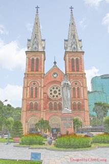
A lacquer painting of the Lady Church

This is actually an image that I have taken of Lady Church. I have used the Photoshop to make it look like a lacquer painting. First, I increased the shadow of the image to 100% and decreased the highlight to 0%. Then, I have chosen the Filter-->Stylize-->Find Egdes. Next, choosing Edit->Fade Find Edges. Then I change the opacity and set the mode as Luminosity. Finally, I created the image of Lady Church look like a lacquer painting


This is the original image.

The reflecting water


In this image, I have created the reflecting water which include the shadow of the statue of the two Goddess. Then, I used the Image Ready to make the animation of the water surface wavering. Please click on the image to see the water wavering. In order to see the better quality of the image, click on the link
http://i112.photobucket.com/albums/n176/soihoang_05/Goddess_waterreflecting.gif

Tuesday, August 22, 2006

The wavy text


First, I have used the Photoshop to create the text. Then, I edited it in the Image Ready to create the wavy text. Please click on the image to see the wavy text

A rainy night


I have used this image as a background for my book cover assignment. In this image, I have tried to create the dark pink color which dominates the image. In my opinion, It will create the gloomy feeling of a rainy night for the viewers.


T
his is the original image